Simple window management for interviews
In the two years, I’ve spent a lot of time performing interviews at my current job — not just for my product group, but for other UI teams as well. Along the way, there are some things I’ve picked that make the whole process easier, things that you wouldn’t necessarily read about.
One of these things is window management. Working at a fully remote company means you might spend countless hours on video calls for meetings, interviews, or even social events. Sometimes you’ll have a Zoom/Skype/Slack/whatever window open and that is great. Other times you’ll have to juggle video, notes, documentation, etc.
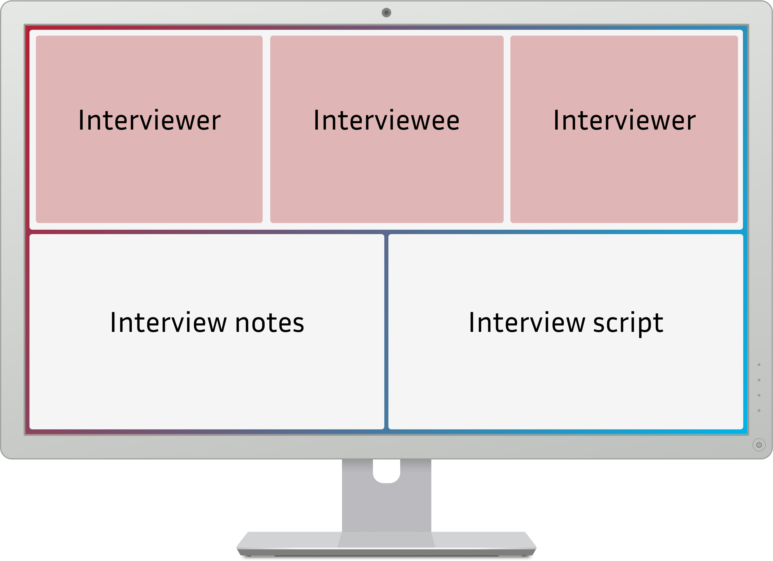
Regarding remote interviews, I think I hit my sweet spot:

Video at the top
Throughout this Covid-induced period of constant video calls, I’ve found the trick of aligning the video thumbnails of people on the call with the camera, so it looks like you are looking at them when you look at their video. This shows more presence on your part, you don’t look constantly distracted (like people with two monitors where the camera is not on the main monitor they look at).
Notes, script and comms
The bottom half of the screen can be split as you want. In my case, we have an interview script that guides us through the sections we have to evaluate and allows us to provide less biased and more standard interviews (i.e. everyone gets pretty much the same questions). I also take notes about the interview as it goes along, ideally without looking at the keyboard (to keep a stronger feeling of engagement). We usually have two interviewers per interview, so I also find it useful to have Slack open so the other interviewer and I can quickly sync about the interview pace or last minute change of plans.
Credits
Thank you to Dmytro Shylin for the Figma monitor mockup.