Let there be light!
Since I’ve already talked about syntax highlighting on this blog, I might as well give you a piece of my mind concerning a few of my preferences on this subject.
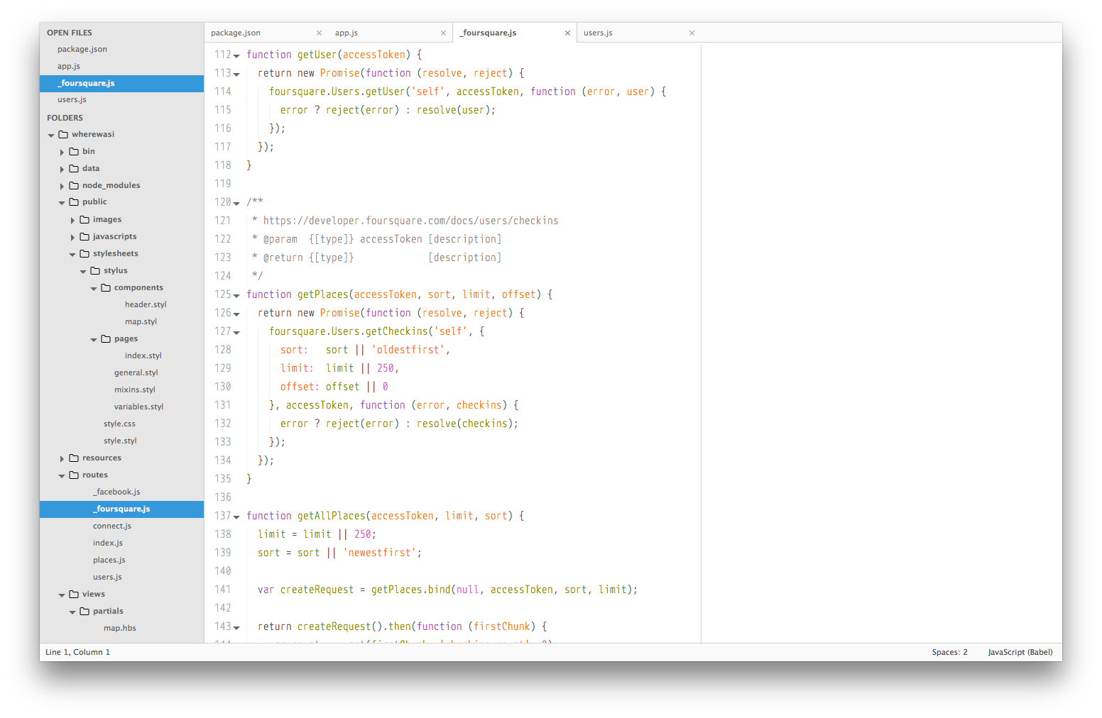
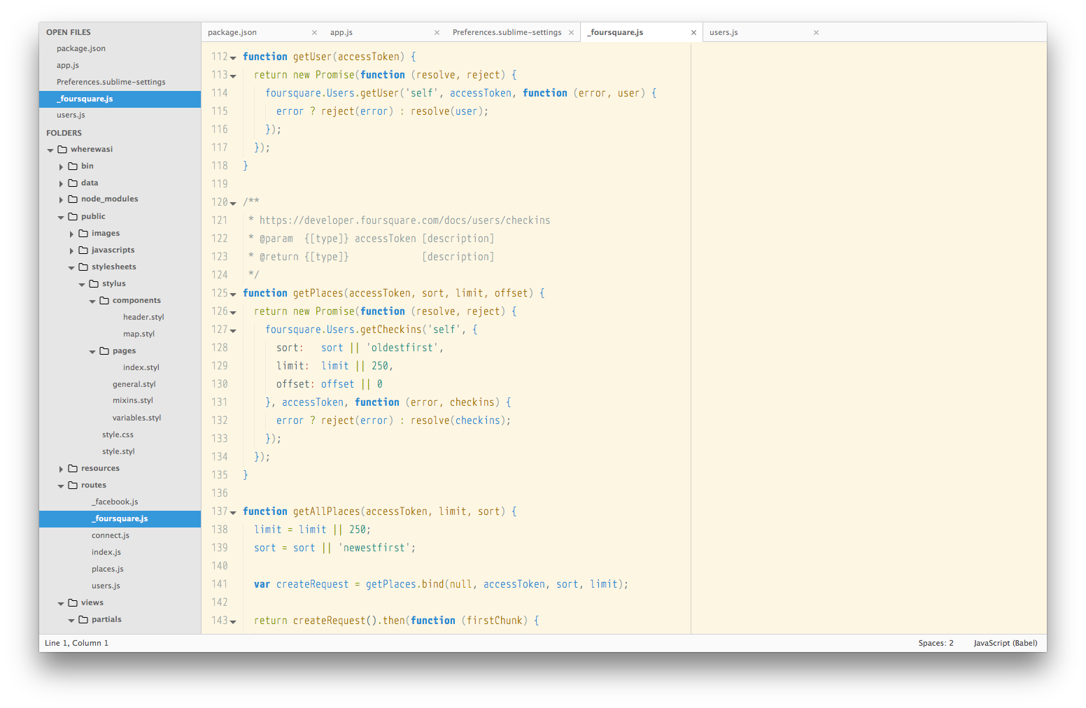
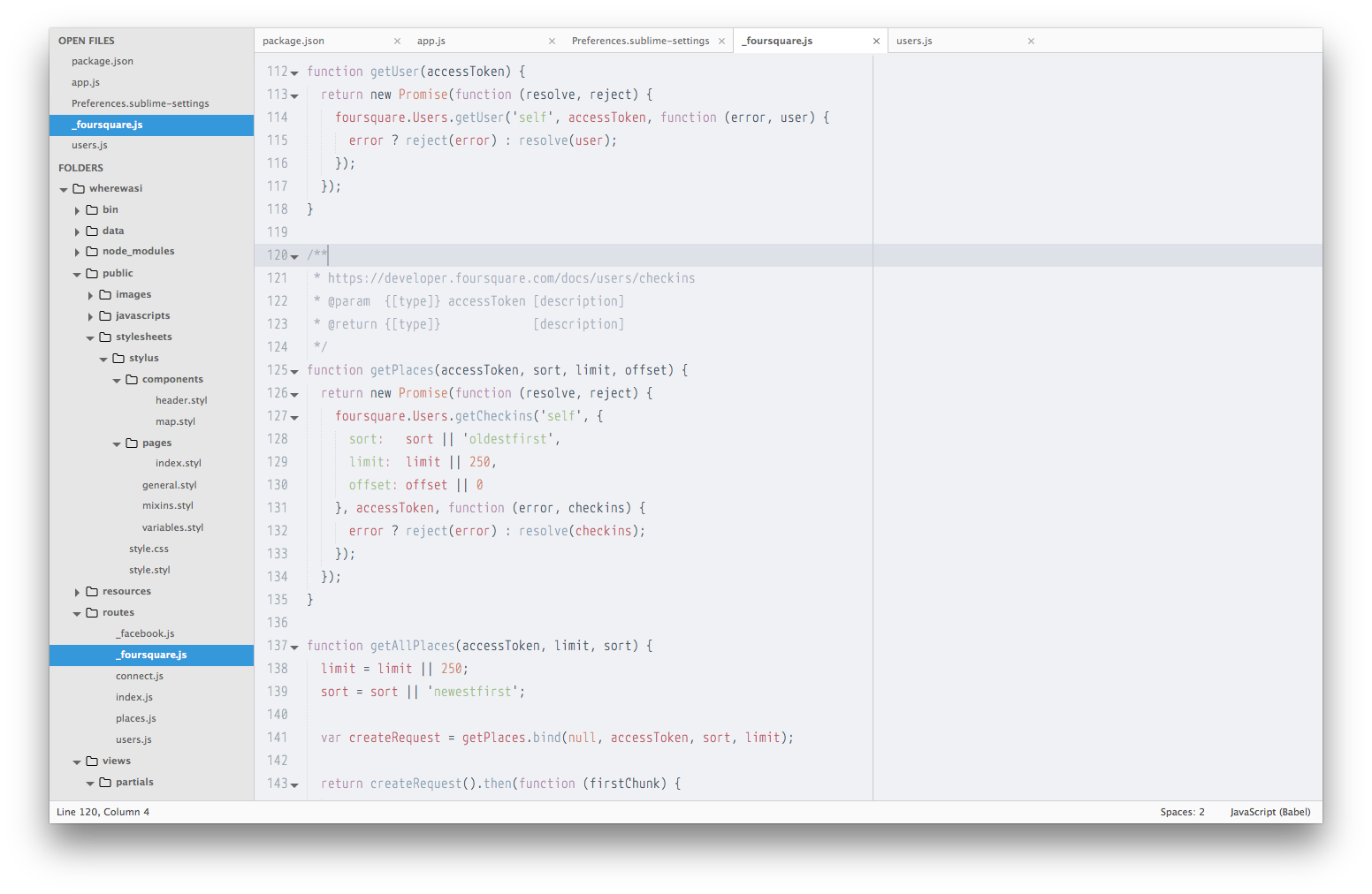
I’ve been increasingly drawn to lighter colour themes, I’ve noticed they ease long periods of staring into these bright windows we call monitors. I’ve started with light characters on top of very dark backgrounds (as I guess 99% of all developers did), but these past couple of years my offices have been so sunny & bright that switching to colour themes that minimise the contrast between them and the room’s background have increased my happiness for sure (and my productivity as well - who knows?).
However, there is not much love for light themes. They are not as popular, not as well crafted as dark themes, and people usually overlook them. I don’t get exactly why, but I’ve been preaching the advantages of brighter colour schemes for months now. So, for future reference (yours, and mine as well), here are my my favourite light themes for Sublime Text:
Piatto
Solarized
GitHub (from Dayle Rees Color Schemes)
Clouds
Spacegray
Some of these colour schemes also bring UI themes, so check them out as well! The one I’m using came with Piatto (also light, Piatto Light 3.sublime-theme).
P.S.: As a front-end developer, I mostly focus on JavaScript, so my main focus of this list was ”Does JavaScript look good with this theme?”